Step-by-Step Photos of Superboy and Snacks Still Life Acrylic Painting


"Solo Adventure," acrylic on panel, 12" x 12".


I've been gradually easing into a few larger works (at least larger to me), and while most have been in the realm of commissions, this one is the beginning of a new series of pieces that are more personal.

I've always had a love for comic books and nostalgia. So when I stumbled upon an array of 50-cent vintage comic books at a local comic book convention my husband and I attended, I walked away with a stack. I didn't need them to be in pristine condition; if they were perfect, many would have been worth far more than 50 cents. But I wanted to paint them, alongside my other vintage or vintage-style items, and to me, the more beat-up, the better.

I arranged this first still life by chance, after pulling some random objects from my collection of props and trying a few things out. But this piece just seemed right, with hints of primary colors binding the three things together. And all in a vintage style. The book is from 1977 - almost 40 years old - so I can imagine a little boy (or girl! We girls like comics, too!) in the 70s picking up this issue of Superboy for the first time and settling in with his or her snacks for a fun solo adventure.

Here are some behind-the-scenes photos of this piece as I painted it. Thanks for visiting!
__________________________________________________________________
1. Starting to block in the drawing with a mix of payne's gray and raw umber.

2. I want this to be pretty accurate, but I know I'm going to be painting over a lot of these shapes, accidentally or on purpose, as part of my layering technique, so the darks are there but not very refined.

3. When I can, I try to work with the broadest areas of color first before I refine any details. So for this one, it was the two yellow areas - on the comic and on the mallo cup package. Two distinct shades of yellow - for the cover I used Azo yellow as the base, for the mallo cup I used Bismuth yellow (one I never used before, but I fortunately had some I'd gotten years ago).

4. For me, I find that sometimes you just have to start getting color on the piece, so it starts to come alive. If I try to refine just a small area at a time, I get bogged down by a lack of enthusiasm. So I keep looking for the places of the painting that are asking to be built up, so I'm constantly enjoying the process.

5. I've added quite a bit of the colors here, so there's at least some paint in most areas of the painting at this point. That also makes it easier for me to see the piece as a whole and figure out what needs to be changed before I start going into the details.


6. I spent many hours refining the details with layer after layer of paint. That means painting and repainting areas until they look right. I'm not a one-shot wonder like some artists are blessed to be! I labor over each brushstroke.


7. In all this piece took somewhere between 25 and 30 hours. But I think it's a leap forward for me and well worth the time. Thanks for visiting!

How to Avoid Texture and Get a Smooth Finish in Acrylic Paintings


"Matchbox Cars with Beetle," acrylic on Aquabord panel, 8" x 8", by Kim Testone.

When I painted in oils, I was introduced to a method of wet-sanding between the layers of my paintings. I simply took a kitchen scrub pad, a spray bottle and water and sanded each layer of my painting after it dried. It would remove any excess texture, as well as a lot of the dirt and grit that had attached itself to the painting. Problem was, it was an incredibly time-consuming process, and my paintings would take a month or two to keep building the layers and wet-sanding between them.

When I switched to acrylics, one of the things I hated the most was the texture. I wanted a slick-enamel-like finish. Instead I got texture everywhere - showing just a bit of each brushstroke.

While some artists love texture and create absolutely beautiful works that are intended to show each brushstroke, my goal was to paint photorealistically, so that wasn't what I was looking to do.

I've come to terms with the fact that there will inevitably be a bit of texture in each of my paintings. Otherwise, I'd spend so much time on them I'd hardly be able to produce anything each year!

But, here are a few ways I've learned to avoid most texture in a painting. Some are more time-consuming than others.

Paint on a Watercolor Surface

In the photo above of my painting "Matchbox Cars with Beetle," I used an Ampersand Aquabord surface. I have discovered that using an aquabord surface can be a great way to avoid raised texture in my acrylic paint because painting in the watercolor style means each layer quickly gets absorbed into the board, leaving me with a flat layer.

The only thing that isn't always my favorite is that there is a bit more texture to Aquabord than Gessobord. Sanding the texture back (which I've tried to do) before starting a painting creates uneven absorbency and an uneven finish at the end. Claybord, which is a perfectly smooth surface, has actually been worse for me, leaving texture on the top because it absorbs so quickly I don't have time to smooth out my brushstrokes.

But I do like using the Aquabord for certain paintings, like the one above. I know, however, it's not something ideal for details like lettering because there's just too much texture on the board.

Sand Between Layers

If I had all the time in the world and could spent months on each painting I did, I'd sand in between all of my layers, just as I did with oil painting.

To sand acrylic paint, just let the layer dry for a couple of hours, then take a small wet piece of 400-grit sandpaper and work in small circular movements, keeping the whole thing wet enough that you aren't creating scratches in the surface of your paint. Then wipe the excess water and sludge with a dry paper towel. Repeat for each layer of your painting. I keep the sink faucet running as I do this so I can clean my sandpaper periodically as well.

Although I only used the modified sanding method described in the next point for this painting, I used the process of sanding between layers for the white painted sides of the painting, to get an enamel-like smoothness and even sheen. This required about 10 coats of gesso, wet sanding in between each layer, follow by several coats of matte medium, wet sanding between each layer, and a final sanding to create an even sheen and texture throughout. It was an extremely time-consuming process. 


Modified Wet Sanding Method 1

I have two modified ways that I sand my paintings that fit more in line with the time I allot to each piece. First, I inspect the piece occasionally throughout working on the painting for any bothersome textural areas - for example, perhaps a bump where I need to put some lettering over top, or a place that creates an odd shadow in the piece. I then use a small piece of 400-grit sandpaper (or sometimes 1500-grit, which is actually an automotive paint sandpaper), to remove just the areas that I deem to be the worst.

Remember, you should only use sanding if you are working on a panel, not on a canvas surface. I use this method on many of my paintings done on gessobord, which is the surface I use for most of my paintings. Wet sanding is also a great technique for getting rid of any dust, hairs or fuzz that have dried in your paint.

Modified Wet Sanding Method 2

This one is still time-consuming, but it can be a way to build a really interesting smooth, almost resin-like finish on a painting. Once I finish a painting, if it's got too much texture for my liking and I really just want to cover it up entirely, I build layers of transparent glazing medium and sand in between each. I did that for the painting below, to make the effect of an old photograph more prevalent. I used matte medium and added about 30 or 40 layers, working in a bathroom with a dehumidifier so the layers would dry rather quickly. The matte medium created a kind of foggy effect, which worked well for this piece. It was also perfectly slick and smooth by the end.

"Love," acrylic on gessobord, 8" x 8" by Kim Testone.

Varnish

A varnish can also be a good technique for building layers that, in the end, create an even texture across your painting. While many artists prefer liquid varnishes that are brushed on, I find that I really have a difficult time avoiding varnish brushstrokes and getting a perfectly-even sheen. So instead, I use Golden Spray Varnishes. Sometimes I can get away with just a couple of layers; sometimes I've added up to 30 layers.

Varnish introduces a new problem to the fold, though - dust. This can also be an issue with building layers of paint or medium, but at least I have my sandpaper handy to handle those. I'll address the issue of dust and hairs in another post in the near future.

Pouring Mediums

I'll be honest - I've had little success in the arena of pouring mediums. Why can't you just pour medium over your painting and let it dry? Crazing. Crazing means that the film will dry unevenly, resulting in pock-marks and crevasses.

Golden Acrylic Paints does make one medium especially for pouring - GAC 800. You can read more about all of the Golden mediums here. While it does sort of work, it gets air bubbles during the pour and requires you to spray the wet layer with isopropyl alcohol to get rid of the air bubbles; but that can leave little pock-marks where the alcohol laid in the layer. So I think this method is probably better for abstract paintings, not realism.

Pouring Resin

Because I am hesitant to work with lots of chemicals due to health issues, I don't use resin, but I have seen some beautiful acrylic paintings created wherein the artist poured resin over the top of them afterward. If you are looking for a slick, truly graphic feel, then pouring resin over your pieces may be a great way to go. For more info, check out Art Resin, which is specifically formulated for artists.

Your Thoughts

Did I leave something out? What methods have worked for you, or do you enjoy having a bit of texture in your pieces? Email me at acrylicrealism@gmail.com and share your thoughts!

Happy Painting!


My Favorite Acrylic Painting Tip - How to Keep Paint from Drying Out on Your Palette

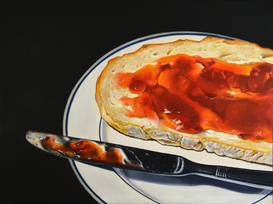
"Bread with Strawberry Jam," acrylic on panel, 12" x 16" by Kim Testone.
When you are making the transition from the lush workability of oil paints to the seemingly stiff tackiness of acrylic paints, it can be frustrating. One thing that I was particularly frustrated with was the fact that the paint on my palette kept drying out or getting that skin over the top after just a couple of hours, or less, so I'd end up throwing lots of acrylic paint away during and after each painting session.

There were several acrylic palette solutions that I was introduced to in college, and years later, all of which I now consider to be really bad in terms of keeping my acrylic paints wet and workable. In college, my professors recommended a gessoed piece of birch panel - but think about that. If you are using a gessoed surface, or any kind of moderately absorbent surface, the moisture from your acrylics will get sucked out as much as it would on your painting surface. I wasted board after board of dried paint in college.

Years later, I tried paper plates - which I'm sure you've guessed is bad for exactly the same reason. All of the moisture gets absorbed into the plate in no time. And although styrofoam plates are slightly better, the paint still dries out more quickly than I'd like. Plus, I don't enjoy going through hoards of plates, and I have no working space to mix my colors and mediums.

I wanted to be able to work as I did when I was an oil painter, so when I started to make my transition from oils to acrylics a few years ago, I used the same palette I did with my oils (cleaned up well, of course) - a Masterson Sta-Wet Palette.

Masterson Sta-Wet Palette - but keep reading for why I don't use the palette paper and what really keeps the acrylic paint wet.


The Real Trick to Keeping the Paint Wet

Now, the Masterson Sta-Wet Palette on its own was great for my oil paints because I could attach lid at the end of my painting session and start again the next day with still-fresh paint.

But I found that acrylics were - as expected - less forgiving. I did have plenty of working space, but I also wanted my dabs of paint to stay wet all day, and although Masterson recommends using palette paper, which fits conveniently in the palette and can be torn off and thrown away, it doesn't extend the working time of my paint enough. And I didn't like how it felt to move and mix my acrylic paints around on a somewhat loose piece of paper. Again, I wanted to work more like I did when I was an oil painter.

In the super-informative book "Acrylics The Watercolor Alternative" by Charles Harrington, the author provides many useful tips for using acrylics like a watercolor. But there was one tip that particularly caught my eye and is not limited to just an acrylic watercolor artist.

Simply - it's a folded damp paper towel. 

I thought it was too good to be true, but this is honestly the best tip I ever learned in my acrylic realist painting. I can place a folded damp paper towel to the left side of my Masterson palette and - this is the important part - put my dabs of acrylic paint directly on the paper towel. And they will stay wet all day, and usually overnight, even without putting the lid on the palette!  

My palette set up for the day with a few of my colors on the damp paper towel. You'll notice there's also a color I mixed in a cup (see Mixing Acrylic Colors Part 1 on why I mix certain colors in cups with lids). A really helpful tip to keep these colors mixed in cups even longer is to scoop a bit of them out on to your palette for your painting session, then seal the cup back up and place it back in your ziplock bag. That way, you aren't keeping the container open and drying all day.

Preparing the Paper Towel

I like to use three sheets of Bounty Select-a-Size paper towels. That seems to give me just the right amount of cushion to hold water and stay damp but not soaking.

Three sheets of Bounty Select-a-Size paper towels

Fold the towels in half, in half again and in half again until you get a strip about two to two and half inches wide. Then run this under cold water. Hold it up with one hand, and place your index and middle finger from the other hand around the towel, and run them down to wring the towel out.

You want the paper towel to be damp but not sopping. If you wring out too much water, it won't stay damp quite as long as you may want; if you don't wring out enough, your acrylic paints may actually melt into the paper towel and dissipate.

Place the damp towel to one side of your palette. I find these paper towels fit pretty perfectly on the short side of my Masterson palette.

Then add your paint!


The Importance of Your Paint Choice

The type of acrylic paint you use is going to in part determine how successful this method is for you. Like I mentioned in previous posts, I prefer to use heavy body acrylic paints from M. Graham or Golden. These have no fillers, a higher pigment load, and they are, to me, more manipulable.

If you use liquid acrylics or a brand that is "puffier" with a lot of fillers, water and additives, this probably will not work for you because the paint will quickly dissipate into the damp paper towel.

Why I  Love This Method - Working on the Palette and Cleaning It Up

What I love about this approach is it makes me feel like I did when I was an oil painter. My paints are wet all day. I get to mix many of my colors directly (except those I mix in the cups) and load my brush directly from my palette (it does stain just the plastic just a tiny bit, but I'm okay with that). I can easily control how much paint and water or medium I add, working in small, progressive swirls across my palette throughout the day.

My palette at the end of the day.
If you use this method, be sure you aren't working in the same area of your palette twice. If you do, you could pull up flakes from not-quite-dry acrylic paint into your new paint mixes.

Sometimes, especially if there is extra space on my palette and my paints are still wet, I do carry this setup over into a second day. But most days, I clean up and start from scratch.

While palette paper is probably simpler for some people, I really do like being able to work directly on my palette, I simply let this dry overnight, then clean it up the next morning.

I toss the paint and damp paper towel, and then use a dry paper towel and my finger nail to scrape up the dry acrylic paint. This might sound tedious, but really, because the paint basically becomes a thin plastic film, it pulls up pretty easily once you get going, and I have a relatively clean palette when I'm done scraping. It takes me just a few minutes to scrape the whole thing.


Scraping the dry paint off the palette with a dry paper towel.


To get any excess flakes, I use a damp paper towel to wipe it off, and I'm ready to start the day again.


What Your Favorite Tip?


I really hope this piece helps make your acrylic painting sessions a little more enjoyable. But remember, everyone's method is a little bit different, so this isn't the only way to do things! What's your favorite tip for working with acrylics? I want this blog to be a place where we can all learn from each other and share what we know, so we can all become better acrylic realist painters. So if you have a tip you'd like to share, or if you'd like to share a post about your process, email me at acrylicrealism@gmail.com.


Happy Painting!


Acrylic Glazing Demonstration on Aquabord - Strawberries - Using a Monochromatic Underpainting

"Strawberries," acrylic on aquabord panel, 6" x 6". 


While I'll return to the color mixing series later this week, I thought I'd share another demonstration piece I originally posted to my personal artist blog, http://kimtestone.blogspot.com/. Enjoy!
_______________________________________________________________

When I first began painting a few years ago, I did an oil painting of strawberries in one of those plastic containers. While it turned out pretty good, it was one of the most frustrating experiences I had yet had in painting - strawberry paintings are not for the faint of heart. But this week, I picked up some organic strawberries that were just so lovely I couldn't avoid painting them.

I knew going in that this was going to be a pretty complicated piece, so I photographed many of my steps as I painted. I had to scour the Internet to find many of the techniques I've learned to use, often adapting oil painting methods to my acrylic process, so I am happy to share here with other artists who may be experiencing the same thing.
And this time - this painting took me about 10 hours, whereas the other strawberry painting took two to three times that. So hurray for that! Enjoy the photos! 

With a piece this complicated, I like to approach it the way one would a jigsaw puzzle - you don't just start; you first find the edge pieces and separate them and build a framework from which to begin. So that's how I'll do this, using a rough drawing and an underpainting in raw umber only. That way I can establish the shapes and values without confusing myself with color just yet.
I think I actually used this very small brush for the entire painting. If you're wondering, it's a 5/0 synthetic sable brush.

I'm working on an Aquabord panel from Ampersand, but sometimes I prefer Gessobord. The difference to me is that with the Aquabord, my paint layers absorb more readily, especially the lower layers, meaning I have less texture in my overall piece, which I prefer.

I use both water and matte medium to thin and spread the paint at this stage. I also go back in with a darker mix of raw umber and payne's gray in the darkest areas and bring out the white highlights, too.

As I begin to add the color, I work in very thin glazes, using straight matte medium most of the time, not water, because I want to build up a rich level of transparency, so the light moves through the layers of paint. This process requires quite a bit of patience, but it is, to me, able to create a far more accurate and pleasing result than I can get with direct painting in acrylics. 
If I remember correctly, the only colors I used in glazing the strawberries were napathol red, cadmium yellow, cadmium orange and ultramarine blue. Purer colors strategically layered over one another to create optical colors helps to create the luminosity I'm looking for. I also don't want to dull the colors with white, so I'm trying to make the white of the background work for me, and get color intensity by lots of layers.
The key here is to not get lazy. Work back and forth to keep refining details and shapes and colors in relationship to one another. Some artists can work more systematically, like in a grid. While I've used a grid on occasion, I really find that I need to be looking at the entire piece, jumping around constantly, to get it to all work together.

My berries are finished at this point. I've gone in a refined the highlights, added lots of glazes and made sure my seeds are more convincing.

Stems are done and so is the piece! It was a great exercise in proving to myself that even a complex subject can become possible when you have patience and follow a good process. Thanks for looking!

Mixing Acrylic Colors Part 2 - A Simple Trick to Mix the Right Colors

"Football Rivals," commission, acrylic on panel, 12" x 12", by Kim Testone.

If you read part 1 of this series on mixing acrylic colors, you learned how to begin to combat the problem of color shift - the difference in the appearance of wet acrylic colors versus dry. In today's post, I thought I'd share the simplest and best trick I've found to keep myself from making fewer color mistakes on my painting surfaces.

What is it? Just a simple piece of white foam board that sits on my easel.

My foam board paint testing ground on my easel, behind a painting in progress.
Initially, I put the foam board on my easel for another reason - to stop my small panels from falling through the gaps in my easel. Then one day, as I was mixing my colors, I thought I'd just give a few colors a swipe on the board, let them dry and see if they were the color I wanted - before I laid a brush to my actual painting.

This simple trick worked like a charm. Now, I use this method pretty constantly in my painting process, because the colors I see in my mixing cups look very different wet and in the cup then on my painting surface.

If you look at the above photo, you'll notice a grouping near the upper center of the foam board shown where there are several shades of a purple gray grouped together. This was me working from a single cup and tinting the same cup over and over with various colors until I got the right one.

I find this to be an especially helpful tip for getting light colors correct, particularly whites, off-whites and grays, which I almost always initially mix far darker than I want. But it's great for any color you are planning to mix in a larger quantity to cover a larger area - as we discussed in part 1.

The "fur" on the illustration in this painting ended up being a mix of burnt sienna, cadmium orange and titanium white. I swiped my color mix on the foam board just to the left of the painting and let it dry to make sure it was the color I wanted before I painted my panel.
If you try this method to check your paints, here are a few additional tips:

1. Make sure you have adequate lighting and let the paint dry thoroughly before you start using it.

2.I prefer to use a non-coated piece of foam board, which more closely mimics the absorbency of a gessoed painting surface.

3. I frequently make mistakes in my cups of color mixes, so I just keep adjusting until it looks right on the board first. Don't just settle!

4. If the cup starts to get too full of the wrong color, scoop some into another cup and start from there. It's a lot easier to fix a small cup of the wrong color than a large one, and you won't waste as much paint.

I hope this makes your acrylic color mixing experiences a little easier! Happy Painting!

Click here to read Part 1 of this series. 


Mixing Acrylic Colors Part 1 - Overcoming Color Shift

Example of Color Shift - The wet paint appears lighter than the dry paint of the same color.
If you've ever tried to paint an area of a painting using a flat single acrylic color, like the color of this notebook in one of my works in progress, you have very likely witnessed "color shift." Sometimes it's more obvious in certain colors than in others, but it's always there. In the example above, the wet paint is significantly lighter than the dry paint. This is just one of the reasons why mixing colors in acrylic is tricky compared to other mediums.

While I mix many of my colors in small quantities on my palette, just as I used to do in oil, it doesn't stay wet long enough for me to use these small piles on larger areas that need to be a single flat color. Using a single flat color is also a great way to establish a local color that is later refined and glazed with details to provide dimension. And because it's next to impossible to mix the exact color twice due to the color shift phenomenon, acrylic painters need a better solution than struggling back and forth to wait for colors to dry to see if they match.

In art stores, they sell fairly large containers intended to store acrylic paint mixes. But I wanted a simpler solution for mixing my colors. I wanted something small, disposable, suitable for my small paintings and inexpensive.

On a whim, I decided to explore the disposable container section of my local Target, and after picking up several items, I was drawn to this one: Diamond Daily Mini Cups.

These wonderful little cups come in a bag of 50, with lids, and are only a few dollars, making them cheap enough for me to mix colors in quantities just large enough for the particular painting I'm working on. I use anywhere from a couple of flat color mixes to up to 20 for each painting.

A few of my color mixes for a painting I'm currently working on.

 These containers will keep the paint fresh for at least a day. However, I have learned that if I store them securely in a ziploc storage bag, I can keep them fresh for up to a week or more, depending on the brand of paint (M. Graham stays wet longer than Golden) and the particular colors (some seem to dry out faster than others).

Paint containers stored in a ziplock bag.


I've found this to be such a simple solution that makes it much easier to avoid the color shift problem. Give this method a try, and I'll discuss additional details about how I mix these colors correctly and use them more economically in future posts.

In the mean time, happy painting!

Click here to read Part 2 of this series. 

Acrylic Glazing Demonstration - Vintage Toy Cars - Step by Step Photos

"Vintage Toy Cars," acrylic on panel, 8" x 8". Completed in an acrylic glazing method.


I thought I'd share an acrylic glazing demonstration I originally posted on my personal artist blog, kimtestone.blogspot.com, a couple of months ago. This method of adding lots of transparent layers of paint using mixes of mostly acrylic medium and a little paint in each layer results in a jewel-like appearance, where the light travels through the layers of paint and back rather than just bouncing off of the surface. It's more time consuming than some other layering techniques but it does create a really unique piece. Enjoy!


_________________________________________________________  

A few weeks ago, my husband and I headed over to his mom's house and dug out his collection of small toy cars from the 1980s. I'd done a painting of some of his toy cars before, but not these babies! These were played with - hard. Still crusted with sand from the sandbox and rusted or dented on many edges, these are vintage with a capital "V." So of course I wanted to paint them.

When I did my other toy car painting, I used my acrylic-watercolor layering technique on Aquabord. For this piece, I decided to try a panel I'd bought from a local arts organization and covered with about six coats of sanded gesso. The difference, besides the handmade panel, is that the paint "floats" on the top when I do my layering technique, instead of sinking down into the panel. I used gloss medium mixed with dozens and dozens of layers of very thin transparent acrylic for this one, which creates a visual depth that I really like. It also simultaneously has a more painterly feel, with the brushstrokes from various layers still evident. In person, I feel like it carries the luminous look of a layered egg tempera painting - with light bouncing through the layers and back.

Here's some of my step-by-step photos of the piece. You can see I start very similar in method to the watercolor style, but again, each layer is basically a little bit of acrylic paint mixed with a lot of gloss medium. Thanks for looking!

 1. With a basic drawing in place, I mix a "black" color from raw umber and payne's gray and begin laying out a monochromatic underpainting, trying to simply thin the paint to let the white of the board peek through.
 2. I need this stage to become a sufficient guide for me as I begin to add color, so I'm not trying to figure out too many complicated steps at one time.
 3. I prefer to lay out the "local colors" throughout the board rather than working on a single section. I find it's easier to keep my place and keep the painting more consistent as I build the layers to bring the entire painting up to the same level before moving on.
 4. Still building local colors.
 5. At this point, I've just started building the bulk of my layers. From here to the end of the painting, I spent roughly 20 hours. That's probably a little tough to see on the small screen, but it made a big difference in getting so many transparent layers and building a luminous painting.
 6. I work back and forth between glazing on the layers and sharpening the edges and details. I want to make sure, for example, that there are appropriate shadows, so the cars look like they are really laying on top of one another.
 7. Getting closer, but it was still probably 8 to 10 hours moving from this stage to the final one. It's little things, like the shapes on the hub caps or the rusty edges that make it unique.

8. And done! Thanks for looking!